There’s a lot of debate about graphics in video game communities. For some, it’s incredibly hard to play a 3D game released on the Nintendo 64 or the original PlayStation because they can’t stand the “bad,” blocky graphics. Others don’t mind the older graphics because they value the story and gameplay over how the game looks. Then there are people who dig that retro look. Now, let’s shape this debate into the context of a visual novel. I’ve seen a lot of people both love and hate the style of many games. From Clannad right down to a ton of indie titles, there seems to be a lot of back and forth on what’s considered good. Today, I want to try and figure out what makes a visual novel’s art good. Does something really need to be pretty to look at in order to be considered good?
Taking a Look at Doki Doki Literature Club!
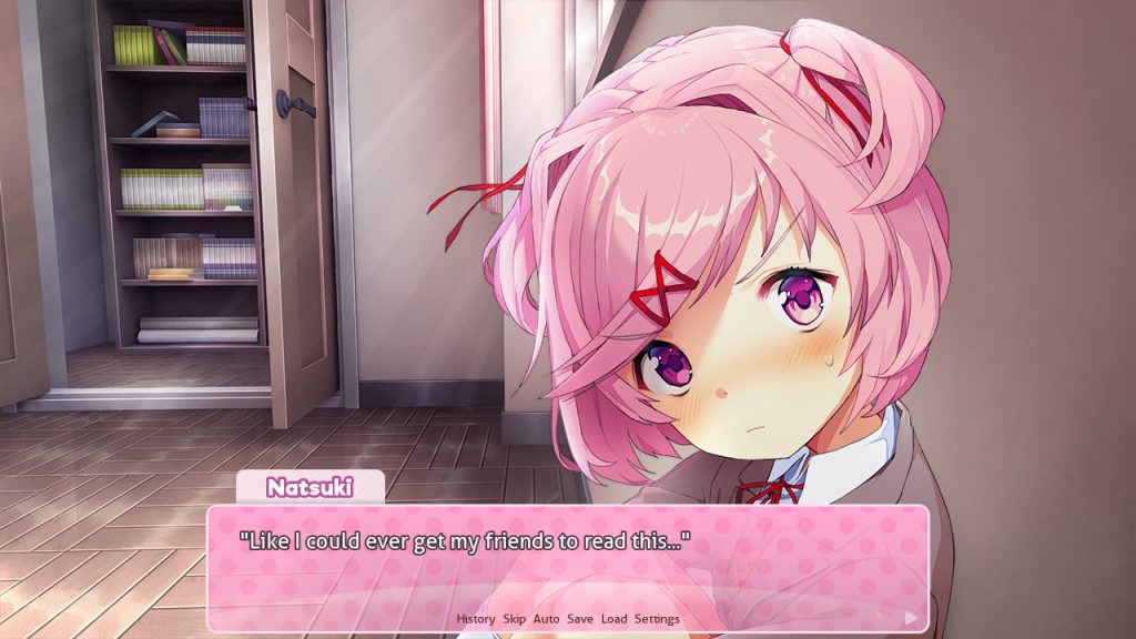
I want to take a look at Doki Doki Literature Club! for a second. This game is filled with beautiful, colorful backgrounds, character sprites, and CGs. Even the characters’ eyes have a ton of detail in them, so much so that you can’t help but get lost in them. Personally, one reason I’d consider this good art is because it’s clear just how much effort was put into each piece. However, just because something looks good doesn’t mean it’ll resonate with others. Despite how popular the anime art style is in the visual novel medium, there are people who don’t like it. Some of those people would even consider this style “bad.” It’s not realistic at all. Critics of the anime art style often say that the characters’ eyes are way too big or their bodies aren’t realistically proportioned.
Even then, I’d still argue that the art is good. However, I’m not going to talk about how it looks anymore. Instead, I want to talk about what it does for the game itself. Doki Doki Literature Club! is essentially a parody of romance games. It follows a stereotypical plot of your male character attending high school and being forced to join a club full of cute girls who also follow standard tropes. You have the shy girl, the popular girl, the girl next door, and the tsundere who will call you an idiot at every turn. While it looks like your typical romance game, there’s actually something much more sinister that lurks beneath. The art works because it’s sorta making fun of romance games. It lures you into thinking that’s what you’re going to get, when in reality you’re going to get something completely different. That’s why I believe the art for Doki Doki Literature Club! works.
Taking a Look at a Different Art Style. Is It Good?
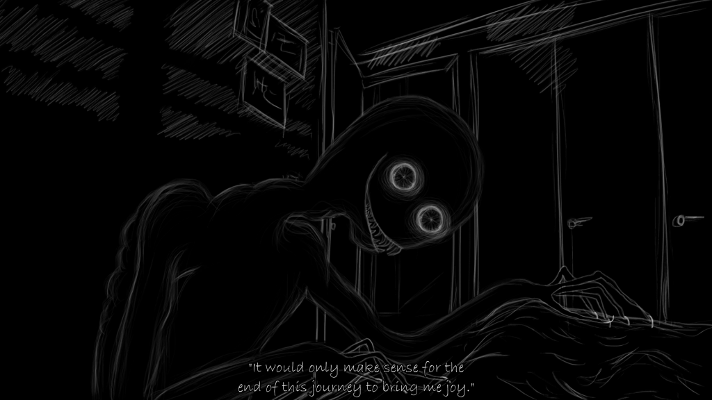
Let’s talk about the short horror visual novel (Don’t) Open Your Eyes. Now, I’d be the first to admit, it’s not the cutest-looking art I’ve ever seen. The art is rough looking. There’s no color; only sketchy white lines that make up the world we’re in and a black background with no real detail in it. This sort of art style may turn off a lot of people. However, we have to ask: is having a bright, colorful, and cute art style really needed for a game like this? After all, it’s a horror visual novel. If you look at it from that angle, the art is superb. It’s unsettling and the rough lines help give off a sense of uneasiness as you play through the game. The big, bulging eyes and sharp teeth on the mysterious figure creep me out. Given the tone the visual novel is setting out for, I think the art is good in this case. It achieves its goal of making me feel unsettled.
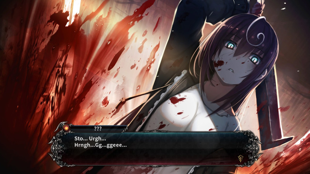
Now, would the game be less scary if it was in an anime art style? Debatable. As we saw with Doki Doki Literature Club!, that kind of art style just worked with the game. There are other games in the genre, like Death end re:Quest 2. It’s an RPG–visual novel hybrid with horror elements attached. In the picture above, you can see that horror element being played out. It’s a super-gory scene of someone being killed by a girl named Mai, the main character. The dead, almost fish-eyed look in her eyes as she swings down the weapon. The dark shadow cast on her face. All of these little details give me the vibe that something isn’t quite right with her and that she doesn’t seem to care that’s she’s actually murdering someone. That unsettles me, even with the cute art style. It’s a beautifully done, disturbing CG.
Conclusion
We can debate all day over a game’s art style: whether it’s good or it’s bad in terms of how pretty or beautiful it looks. Art is subjective. However, I think what we can agree on is how effective the art is in the story that’s being told. Visual novels, as I said earlier, are text-heavy games with an emphasis on the visual aspect. While trying to tell an engaging story, you need to have something the player will look at. As I’ve explained, your art doesn’t need to be “pretty-looking” in order to be considered good for your game. You don’t need to hire the next Van Gogh to do your artwork. You can, but you have to make sure that art is going to fit the tone of your game. If the art style fits with the game, even if it’s incredibly rough-looking like with (Don’t) Open Your Eyes, then personally, I’d consider it great art. It accomplishes what it needs to do and really adds to the game’s storytelling. That’s what good art in a visual novel looks like.

